Is Sky Q really the future of TV? It could very well be
The company’s new set-top box is arriving next week, and it plans to tie together both traditional and online media.
WHEN YOU CALL something the “biggest re-imagining” in your company’s history, you want to be able to back it up.
That what Sky called its latest set-top box, Sky Q, back in November and it’s making its way to Irish users next week.
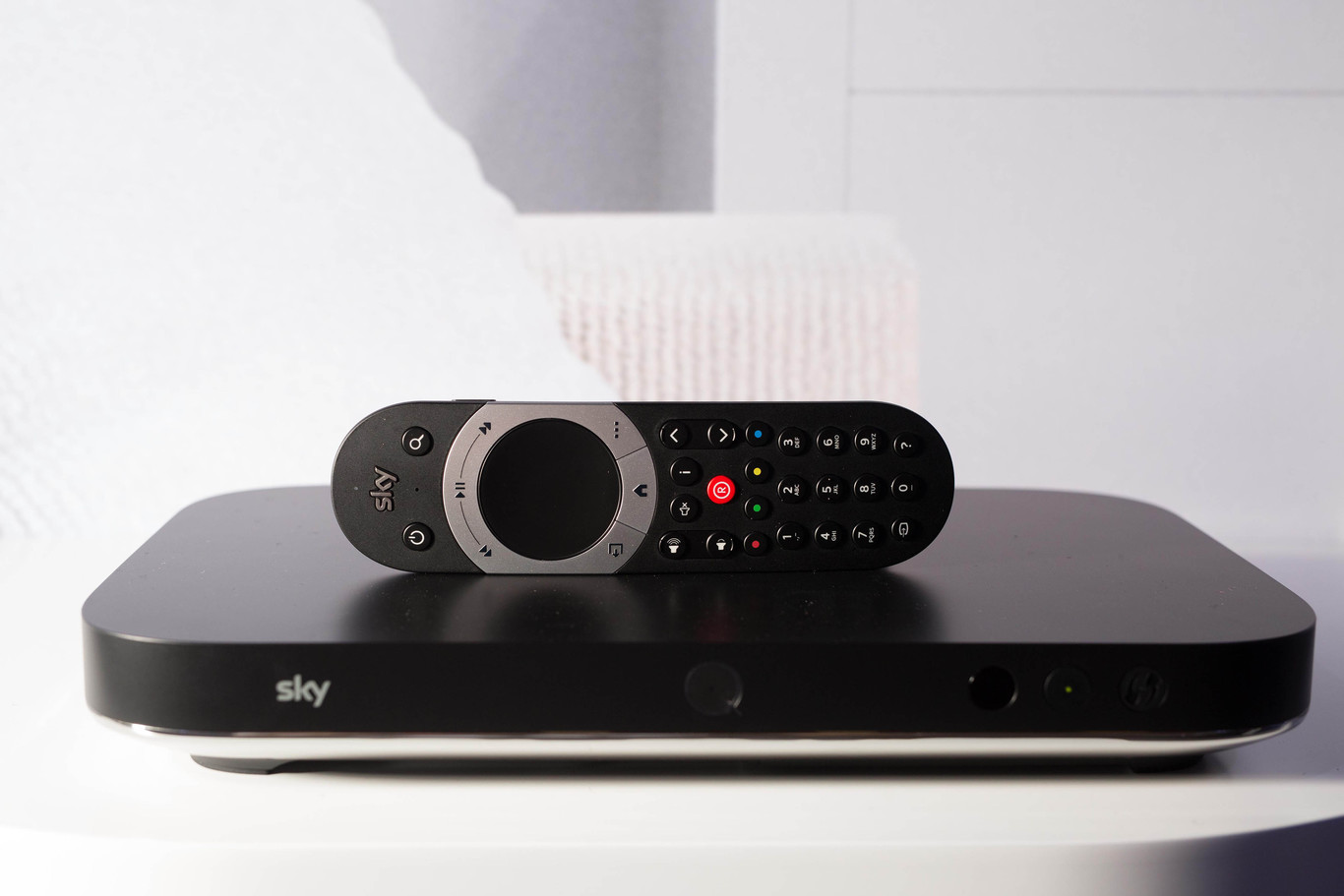
The other new additions are a wireless router called Sky Hub, a plug in and play set-top box called Sky Q which allows streaming shows and recorded content to another TV and the Sky Remote comes with a touchpad for navigation and selection.
This sounds nice in theory,but how it works in practice is another thing entirely. After experiencing a demo of the new system, which took place in a rather fancy apartment in Dublin city centre, you get the impression that a lot of thought went into this and it shows.
Design logic
The main set-top box is a Ultra HD device with 1-2TB of memory and can record up to four different programmes at the same time.
The major addition is fluid viewing which allows you to pause a show in one room and continue watching it in another via another TV or tablet. Shows and recordings can also be saved onto your tablet or phone in HD or SD depending on the amount of space you have.
In terms of interaction, the interface used to navigate and choose shows has received the biggest overhaul. Instead of using a combination of vertical and horizontal menus, it makes use of the larger screens now standard with HD and UHD TVs to display relevant information.
It’s split up into three main sections: what you’re watching right now, the navigation menu and a preview of what you’ve currently selected. No matter what you view, the menu will always be vertical which is down to making navigation easier to understand for users – throwing in both vertical and horizontal menus requires more effort to navigate.
It works better in practice and the positioning ensures you’re not lost if you’re looking for a recording or new show.

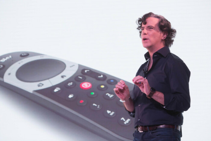
Developing a system that balances choice with accessibility was a major challenge for Andrew Olson, Sky’s director of product planning and design. It wasn’t just developing a new menu that felt natural though touch but adding in all the little things that turn it from something functional for the user to effortless.
“One [challenge] was this it has to look like a 60-inch iPad,” said Olson. “It has to have that fluidity [for navigation].
Touch [on the remote] was probably the hardest. To sort out what makes it feel right, that was just hard and no one had ever done it before … and for all the little things like glow [and other visual elements in the menu], it was hard to figure out why it didn’t feel right.
The essential part of the design was to make sure the path between watching a show and selecting another one was straightforward. If your menus are confusing or cause you to forget how you got there, that can cause issues.
The problems increase when you want to give space to your own shows and content like Sky Q (its content recommendation service), movies, kids shows and sports. Keeping it linear and minimising the amount of time spent exploring menus was vital.
“It’s all one path. It’s not two different things that are happening that could be confusing,” he says. “The thing that’s important is minimising effort because five clicks that require no mental effort is better than three where you have to read a list and make an active choice”.
The thing that people want to do the overwhelming majority of the time should be mindless and the rest should be an easy path to it but don’t make people choose every time.

‘Bit-by-bit’
The other element that will be included is apps, not an original choice by any means but one the company is slowly embracing.
While the likes of Apple TV and Google Chromecast allow apps to be developed for their respective platforms, Sky’s approach is going to be more focused. You have the standard Sky apps for sports and news at the side, but others like Facebook photos are also included. For now, you can count the number available on both hand but keeping it focused was a deliberate choice.
“We will expand it bit-by-bit. There are definitely things we want to do that we haven’t done yet, but we have to be very very careful,” explained Olson. “The TV experience has to be better for having it there too … but we’re going to be really judicious about picking the right things and moving slowly”.
 Andrew Olson talking at the launch of Sky Q back in November.
And that’s probably the best way to describe Sky’s new set-top box. There’s no massive leap here in terms of ideas, it’s building on many principles it’s had before, but it’s the execution and design that will be the difference.
The included features (and pricing) may tailor it more towards families but it feels like a necessary step forward for a medium that’s being undercut by online video and TV. Is it the future of TV? It’s tough to say now but it’s certainly in a good position to try.
Sky Q will be available on 9 February and will cost €99 to set up. Monthly costs will start from €55 a month.


