Want a great company logo? Try thinking of your business as a rock band
This graphic designer delivers a masterclass in making a memorable mark.

DESIGNING A LOGO requires more blood, sweat and tears than many other graphic projects – but the work is a lot more gratifying.
In a way, I think creating a logo is the purest form of design. You put in a huge amount of effort to end up with a tiny, perfectly honed mark.
When I’m designing a logo, the first thing I’ll do is sit down with the client and try to get under the bonnet of their business.
At the very least, I’ll ask them to fill in a questionnaire that I’ve developed over the years.
I don’t want to give people homework and take the love out of the project, but I need to garner as much information as I can from the client.
The questionnaire asks all the obvious questions. What does your business do? What makes you separate from everybody else? What are your long-term goals?
Then it gets a little more obscure. If your company was a TV show, what would it be? If your business was a friend, what three words would you use to describe them?
If a client can tell me what musician or band their business is like, it really paints a deeper picture than simply asking direct questions about their product.
I’ve found that many of my clients enjoy this process because it can give them sudden clarity about their position within the market, their marketing tone of voice or the nature of their own client base.
These things take time
After I’ve collected all the information, I usually sit on the project for a week or two and let it simmer in the back of my head.
If you sit down and try and force a logo design, it won’t work. In my experience, you need to let it ferment and develop somewhere in the recesses of your mind.
When I come back to the project, I’ll spend another week or so sketching out ideas and exploring different options.
Logos aren’t just about the aesthetics – they have to be able to adapt to different mediums.
Just 10 years ago, most of my branding work would have appeared in print format. That’s completely changed and now I’m designing far more for a digital environment.
That can create a challenge – digital is a lot more flexible than print. Sometimes you can design a really beautiful mark that works perfectly on a poster or business card but completely fails on a website or social media site.
Often a logo that is fantastic on a letterhead just doesn’t work as a web banner. That’s why it’s important to mock up a logo across a variety of media to see if it operates well across a wide spectrum of environments.
It depends on the scale of the project, but it can take months to go from a blank page to a fully formed, beautiful logo.
What makes a great logo
I think the number-one quality that every successful logo has is clarity. A great logo has to be simple and it has to be instantly memorable.
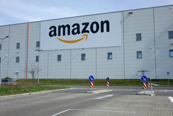
Some logos rely on a clever idea, a bit of a wink. For example, there’s the Amazon A to Z mark that also doubles as a smiling face. Some projects really succeed by utilising those kinds of hidden messages, but it doesn’t suit all brands.
In my mind, you’re always got to pare back a logo to its simplest elements; less is definitely more. You might have noticed this trend in recent years.
If you look at the big guns like Apple, Mercedes or Starbucks, you’ll see from the history of their logos that they’re just constantly refining them, endeavouring to reduce their logo to it’s purest form without losing its key identity.
A lot of companies refresh their logo over the years rather than go for a complete rebrand to ensure they maintain their brand equity.
Refining an existing logo requires a lot of work that may not be immediately apparent but can have a very real effect in the marketplace.
Penguin Books has stuck to the same strong logo for more than 80 years, but it’s been subtly adapted over the years to reflect where the company is and to maintain its position in a constantly evolving market space.
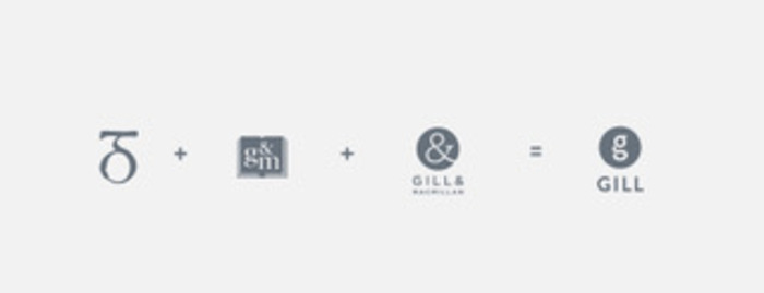
One of the logos I’m most proud is the branding for Gill, the book publisher.
Having redesigned their logo some years ago when they were Gill & Macmillan, it was a fascinating journey to produce a mark that reflected their new name and lineage but said something about where the company was going.
Is it worth it?
Some people are outraged that some companies decide to spend hundreds and thousands of euro on rebranding exercises.
Bear in mind, though, that if a sizeable corporation increases its revenue by even 1% by successfully rebranding, the value in that logo redesign becomes obvious.
You can understand in that scenario why huge companies spend so much on changing their logos.
That said, if you’re a little bakery for example – or any kind of SME for that matter – you don’t need to spend an absolute fortune on a logo. However, investing in a beautiful logo that is unique, professional and reflects the core nature of your business is invaluable.
Graham Thew is an award-winning graphic designer. This article was written in conversation with Conor McMahon as part of a series of masterclasses with some of Ireland’s top design professionals ahead of the 2017 IDI Ireland Awards, which features Fora as media partner.