'In-jokes' and gutsy design - the secrets to an unforgettable logo
Three top Irish designers share their tips for the essential piece of branding.

THE MOST MEMORABLE logos have some kind of ‘in-joke’ — they require a double take. That’s according to Paul Gately, creative director of Motif design studio.
“A logo is the base point, the foundation stone of a brand,” he tells Fora, adding that the brightest design ideas stem from “bravery and having the guts to do something different”.
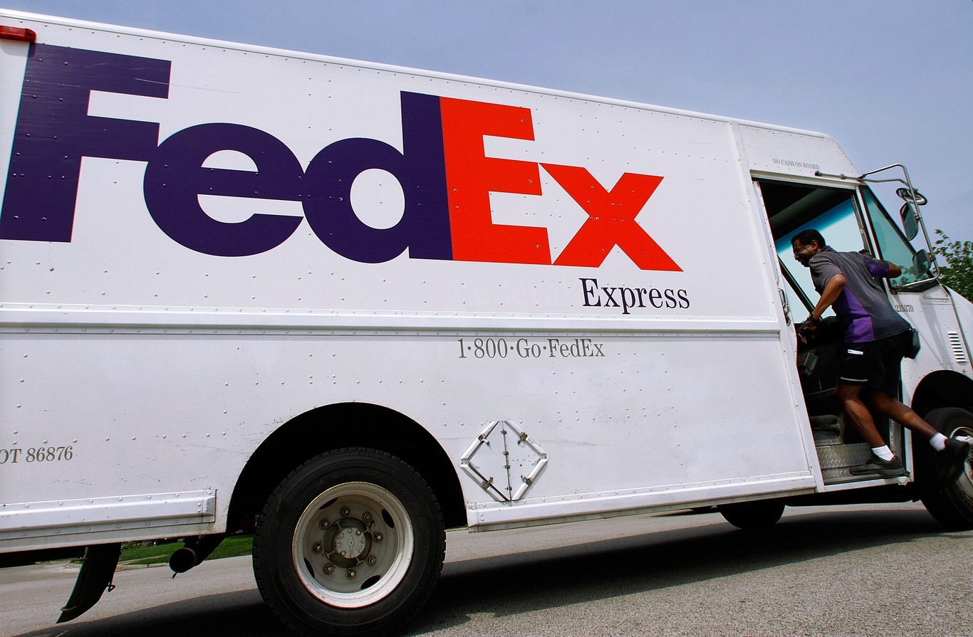
That’s why once you’ve spotted the secret arrow on the side of a FedEx van or the hidden bear on a Toblerone bar, it’s hard to ignore.
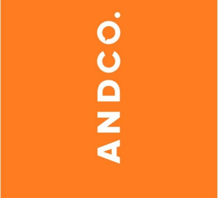
Gately has used this kind of quirky technique in his own work. For example, the logo he designed for law firm AndCo is upended to reveal a speech bubble in the last letter.
Inspiration for a logo can come from anywhere. For Gately, a jog will give him the headspace to come up with ideas. Simply “getting away from the pixels” and doodling with pencils and paper helps too.
Limits
David Wall, a partner at Workgroup graphic design firm, also finds inspiration in unlikely places.
“For anyone who has worked in the (design) field, you have to have that quality of being a bit of a sponge for ideas,” he says.
“Obviously, I enjoy graphic design and it’s my life’s work, but I also love film and music and art. You can draw inspiration from the strangest places.”
Like Gately, Wall admires designs that “invite further exploration”.
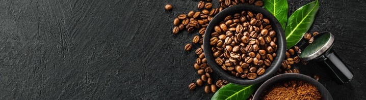
“We did a lot of work for 3FE (coffee company),” he says. “You go into a cafe and all the coffee cups are stacked upside down. So we said we should have a logo that works both ways.”
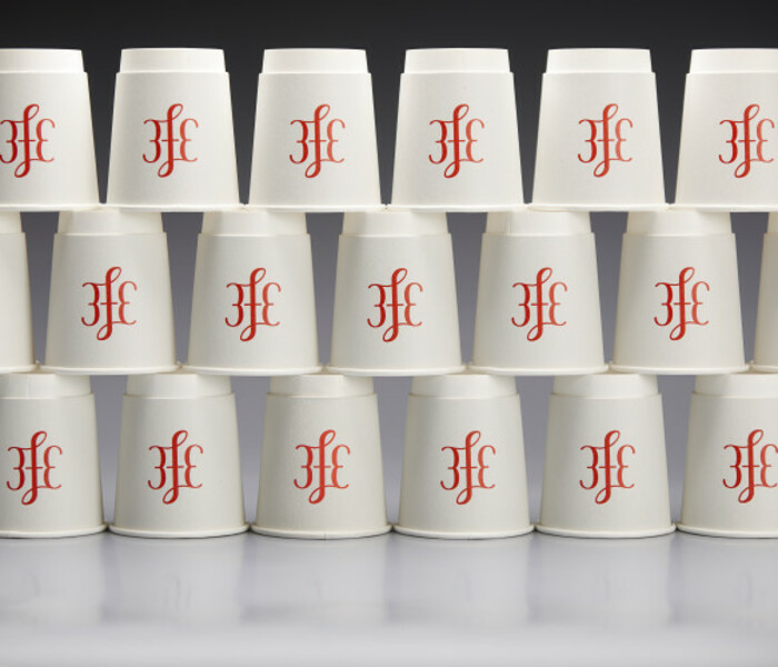 3FE paper cups
This kind of “functional limitation” helps Wall be a bit more inventive with his logo ideas.
“It takes it from being an arbitrary thing in terms of how you’re making decisions into ones that are very rooted in reality,” he says. “You’re trying to cut out all the arbitrary stuff so that everything is there for a reason. Type, layout, imagery, everything needs to have a bit of a purpose.”
Collaboration
Creating a logo is very much a collaboration between the graphic designer and their client.
Catherine Robertson of Red Dog says a client “would go through a very thorough (interview) process” to help give the designer some clues for what visuals might work in a specific sector.
This also allows a designer to figure out how experimental a company is willing to be with their brand.
Some requests can be light on detail, while other clients can be a bit more controlling, but “you’ll always find positives from the smallest perimeters,” Robertson says.
As well as working with major firms like KBC bank and building materials firm Kingspan, Robertson recently redesigned the logo and visuals for Scoop, a small ice cream shop in Ranelagh.
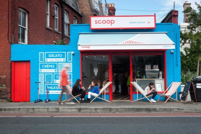 Scoop ice cream shop
The challenge for that project was that the new look had to work on the web as well as on coffee cups, ice cream tubs, signage and tote bags.
“A logo works hard in itself,” Robertson says, but it really comes to life when it is used in different contexts.
That’s why her favourite logo is the V&A design for the Victoria and Albert Museum in London.
“It’s timeless and I’ve loved seeing all the different applications over the years.”
All three designers are shortlisted in the Institute of Designers in Ireland’s 2016 Design Awards, which features Fora as media partner. Vote for your favourite design by midnight, 16 November 2016.